UI-polish: some before and after shots of an open-source iOS development tool, Symbiote - part of Frank by Pete Hodgson.
For speed, Pete set me up with a quick sintra-based/dummy-data instance of symbiote. Want to contribute to the UI? Here’s the mini-repo symbiote on github.
The diff
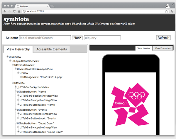
- Eliminate full-page scrolling.
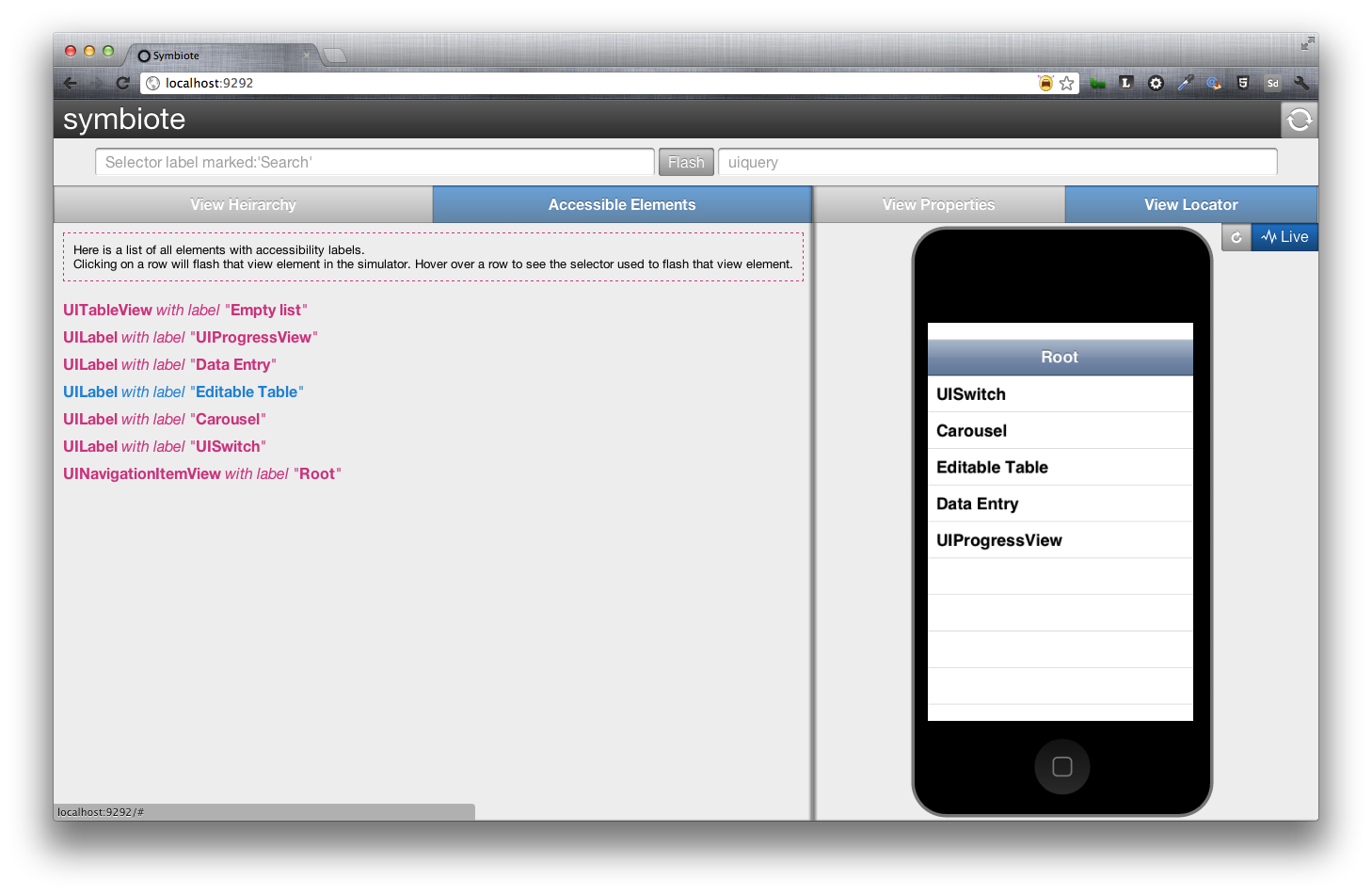
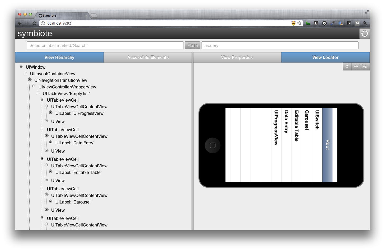
- Create space for a landscape iPhone.
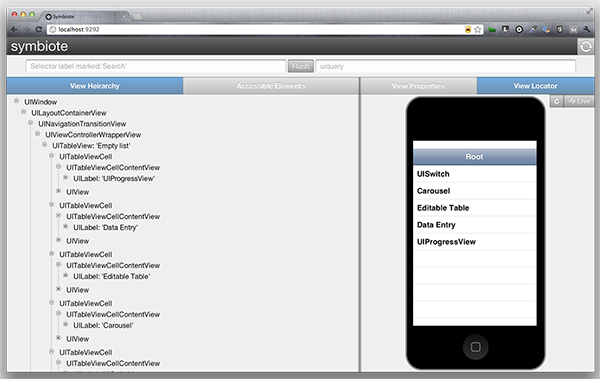
- Polish a few pixels and soften the ui.
Eliminate Full-Page Scrolling
Lock the viewport so that the user wouldn’t have to scroll to the see the iPhone.
Before: The user would scroll the full body of the page to see the iPhone.
After: The iPhone is always visible to the user and the body does not scroll.
How? The iPhone is set to be the height of the container. If the user resizes their browser, The left-column’s content is scrollable.
Create Space For a Landscape iPhone
Before: The iPhone wouldn’t rotate.
After: The iPhone and containers animate. The iPhone rotates 90-degrees as the containers change proportions from 60/40 to 50/50.
How? To animate multiple elements at once, I applied a class to the containing element and allowed my elements to respond to it.
Left/Right vs Width First attempt was to animate the width of the containers, but the box-model caused the containers to jump before scaling. So instead I animated the Left/Right properties to get the desired effect.
1 2 3 4 5 6 7 8 9 10 11 12 13 14 15 16 17 18 19 20 21 22 23 24 | |
Polish a Few Pixels and soften the ui
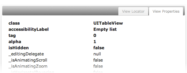
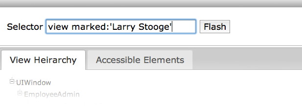
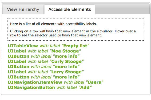
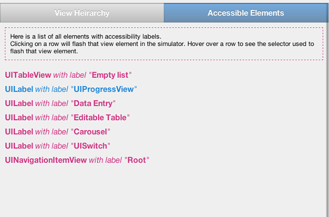
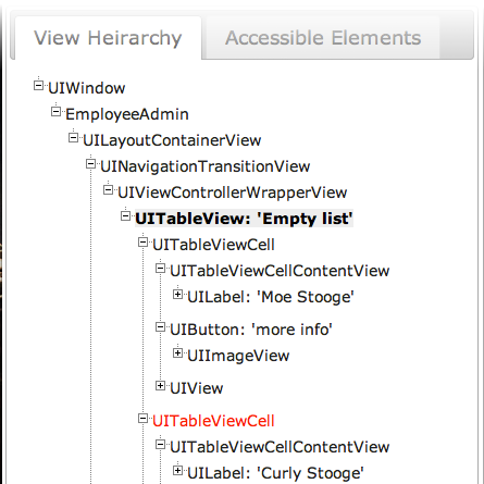
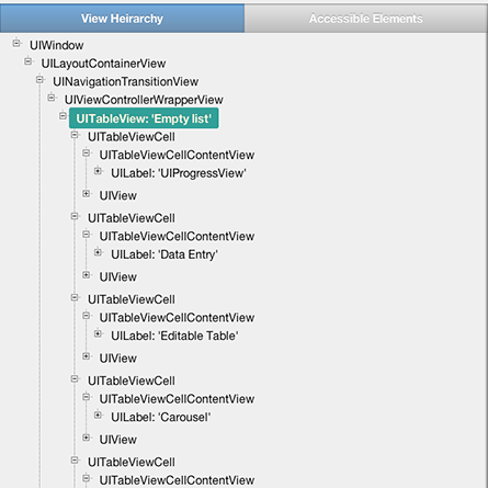
Before: Symbiote was originally put together with JQueryUI and that lacked the custom feel that this piece of software deserved. A few of the colors were a bit harsh for the target users (iOS devs), who may be looking at a screen for hours at a time.
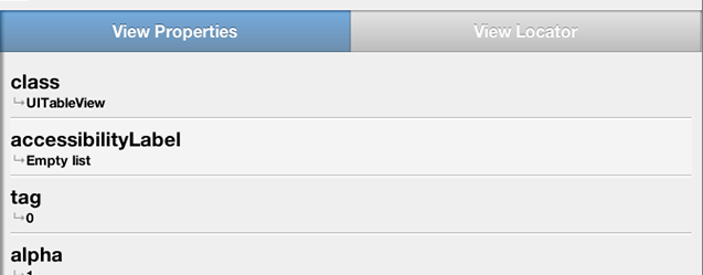
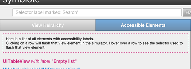
After: Solarized provided some soft colors, button-gradients for depth, quick transitions to hover effects, subtle border-radii and box-shadow bevels on the containers, border-bevels to list elements, shrunk the header, and moved the refresh button out of the way in the top-right corner. Polishing pixels can go on for a lifetime, but this was a solid first pass.
What’s next?
I’ve got some work to do around the landscape view of the iPhone. Upon resizing the browser, the iPhone still thinks it’s portrait mode (due to the 3d-transform used to rotate it).
Some user feedback.
Care to help provide some feedback on the symbiote ui? Symbiote on github.
- Leave feedback on github.
- Maybe drop a usage-video link.
- Send Pete a pull request.