A print/information-design sample from a contract gig I did for Digitas Recruiting.
The concept:
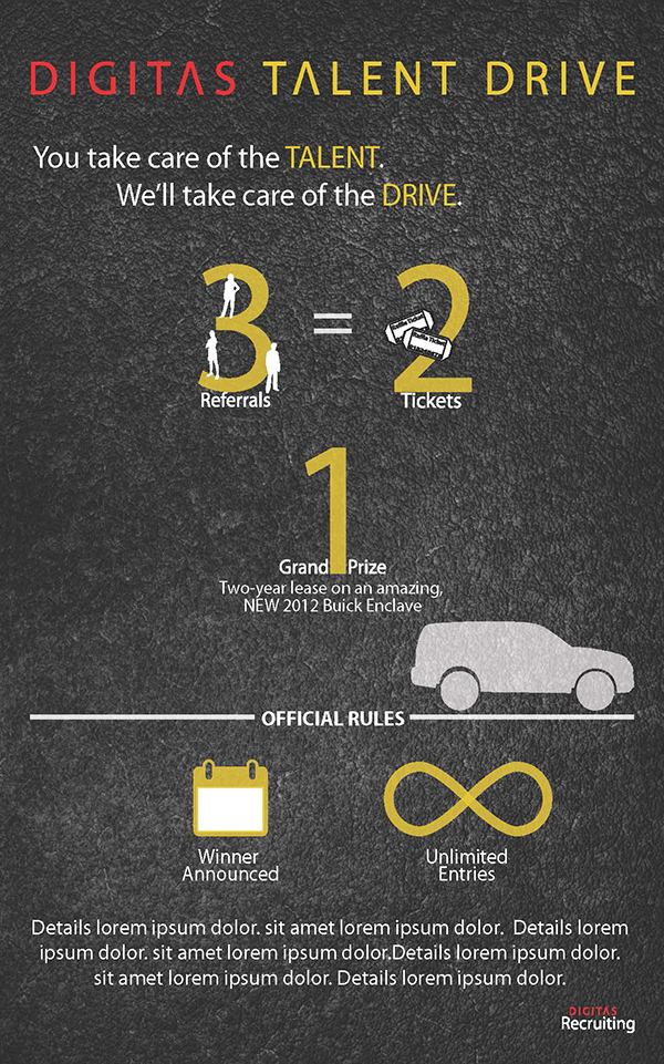
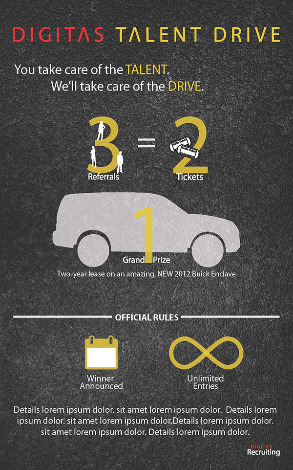
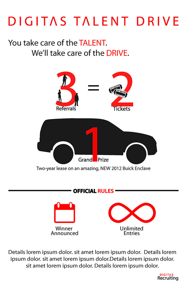
- Digitas recruiting would hold a contest for internal referrals.
- For every 3-referrals, an employ would received 2-raffle tickets.
- There would be 1-grand prize winner.
- They needed a ‘teaser’ and a full poster to hang up around the office.
What I came up with, presented in this order:
- A small teaser.
- 2 layout-variations.
- 2 color-variation.
- A blank canvas to avoid locking into a snowflake.
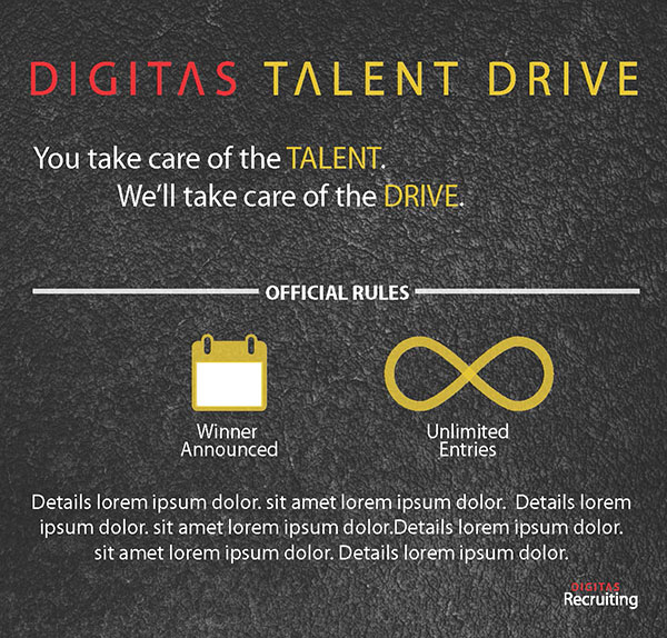
A Small Teaser
Why? The teaser shouldn’t take up as much room on the wall/board because the contest hasn’t started and this is just a small preview.
2 Layout-Variations
Why? The vehicle may change by the time the contest starts and the SUV shape might not work any longer. This small varation gives stakeholders some flexibility to pivot on their prize.
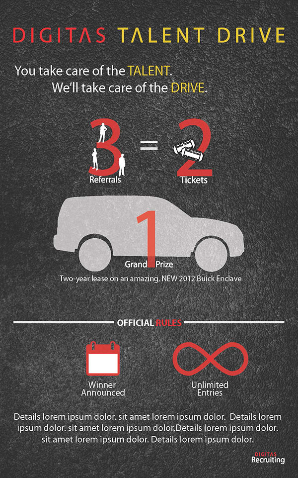
2 Color-Variations
Why? To show stakeholders that this design could work within variations of their brand-palette and give just enough contrast to avoid locking into 1-idea.

1 Blank Canvas
Why? To allow stakeholders to think about the visual language of the graphic elements; the colors and asphalt-texture aren’t needed to convey their message.

Why present this one last? To end the presentation with a blank-slate, a clean view of the idea - not of my specific visual design.