Partender Purchases (2016)
Concept, IA, UX, UI, Motion, Visual
The first rollout of purchases involved 2-steps: Orders and Invoices. While this is common domain knowledge, it was very important to insure that users understand the different between these two steps.
UI: Purchases Home
Create understanding: The primary goal the Purchases home page to help the user understand the distiction between Invoices and Orders.
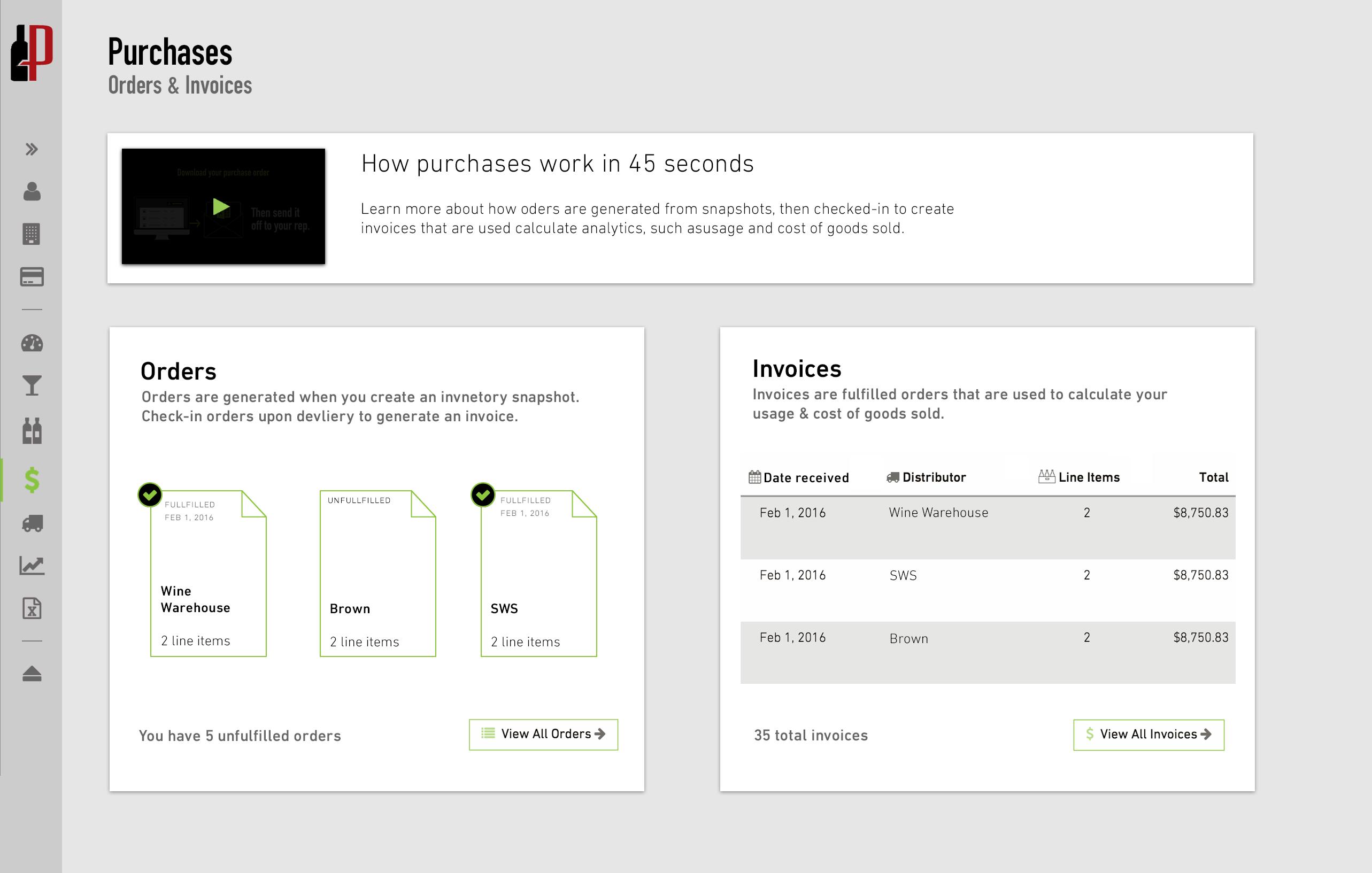
Video header provides context
The video is prominently placed at the top of the screen. When clicked, the video opens in a dialog box. Upon a user’s first visit to the page, the video dialog would be open by default (with an option to close it of course).
List display styles create distiction
The two lists display a maximum of the last 3 Orders and Invoices. The reasoning to limit the list to 3 was to simplify the page and maintain the focus: helping the user to understand the distiction between Invoices and Orders.
In an effort to create distinction between the two lists, I gave the Orders a grid and the Invoices a table. I chose a grid for the Orders because the Orders needed to indicate whether or not they had been fulfilled. A grid afforded the opportunity to display a prominent checkmark/decoration. I chose a table for the Invoices as they display a total price that is better served with a right aligned vertical list.
Information Architecture
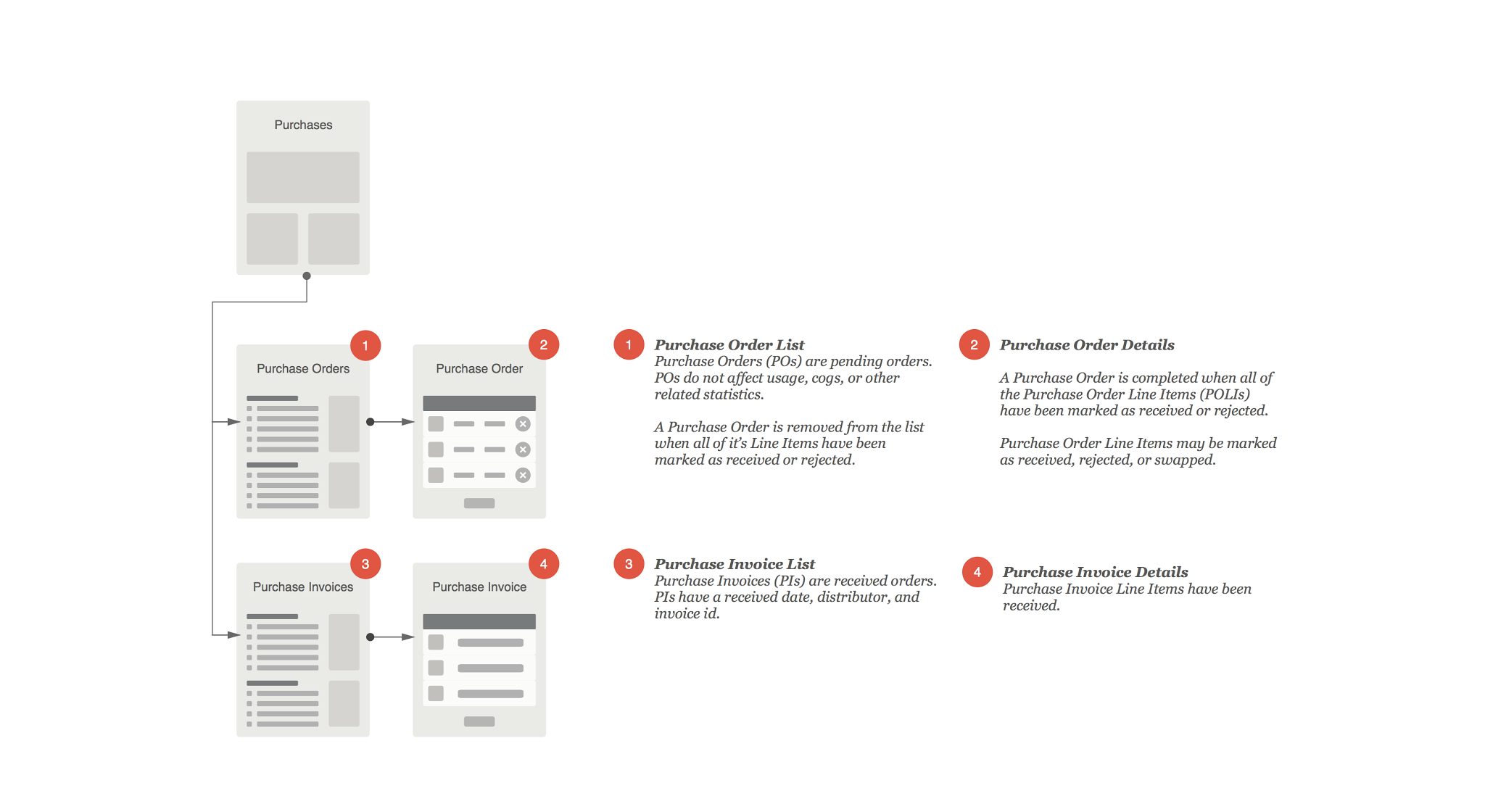
I created this low fidelity user flow to communicate the distinction between Orders and Invoices to my development team.
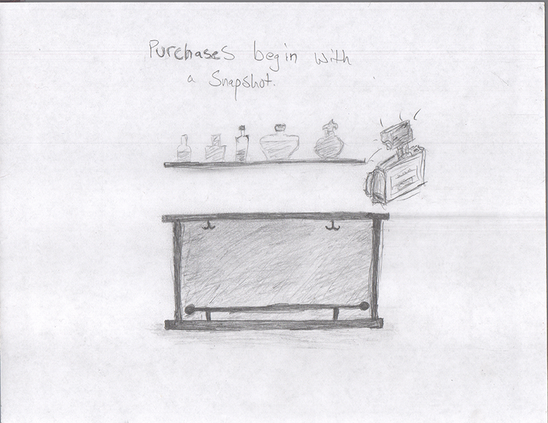
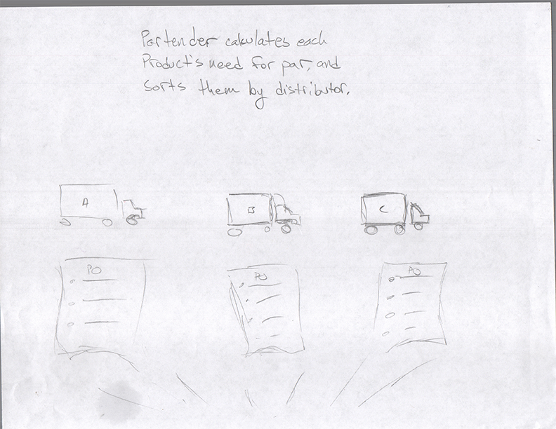
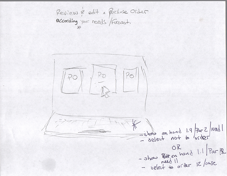
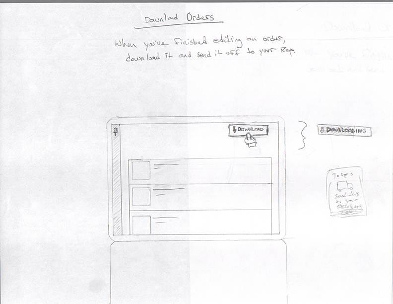
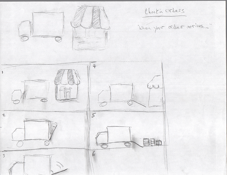
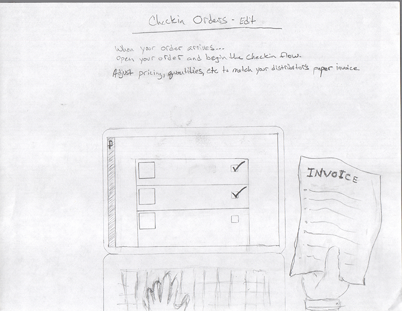
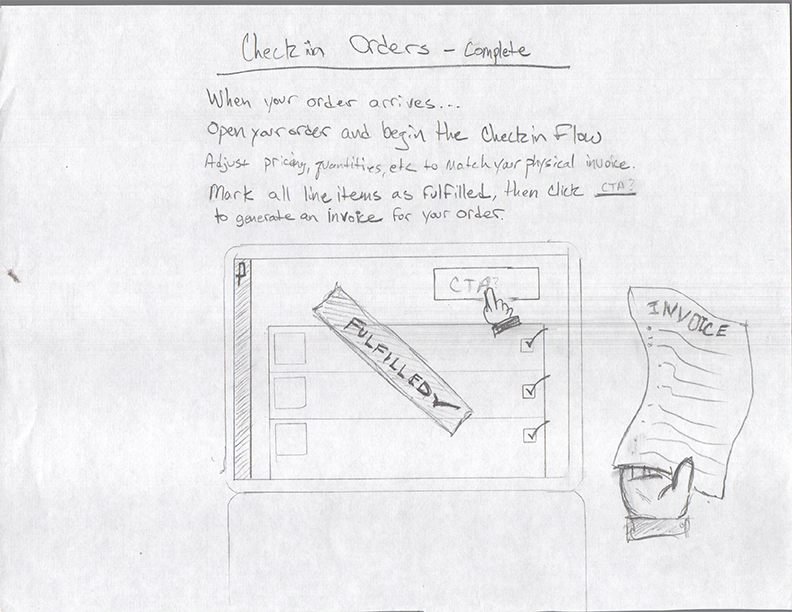
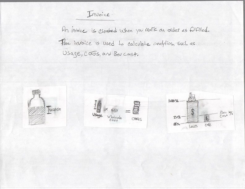
Video Storyboarding Sketches
Before jumping into creative suite, I started by sketching the storyboard. The original storyboard had many more pages than this final cut. Sketching helped me to efficiently focus on the content, comminicate that content to my team, and make cuts before spending bandwidth on higher fidelity.
