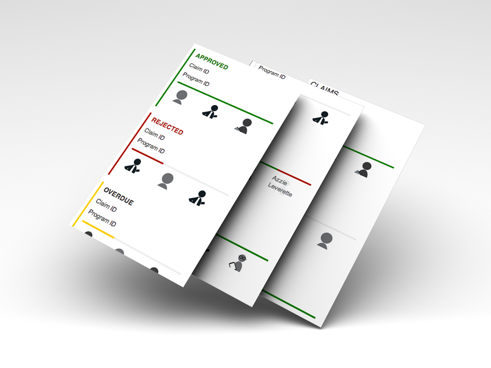
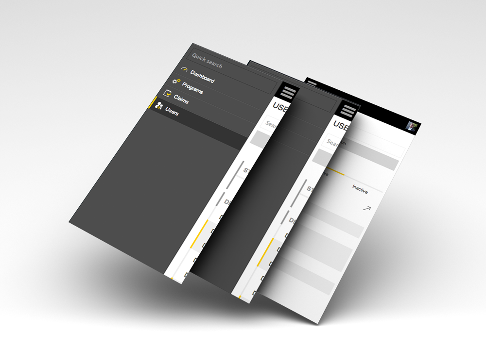
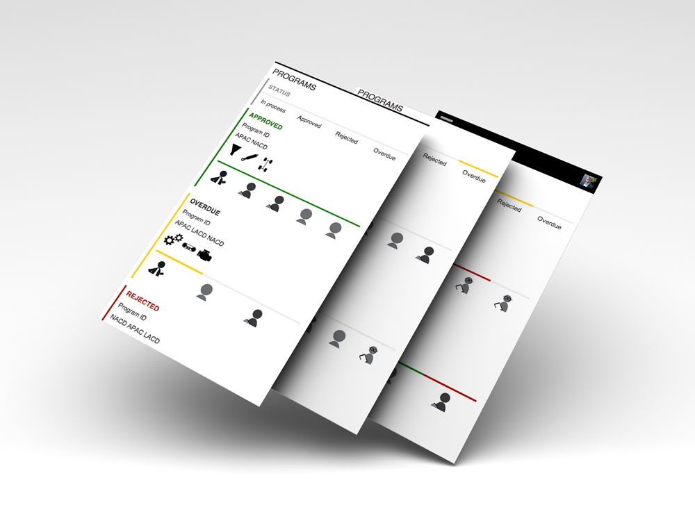
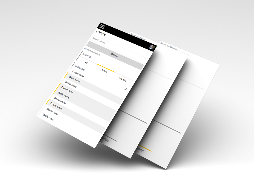
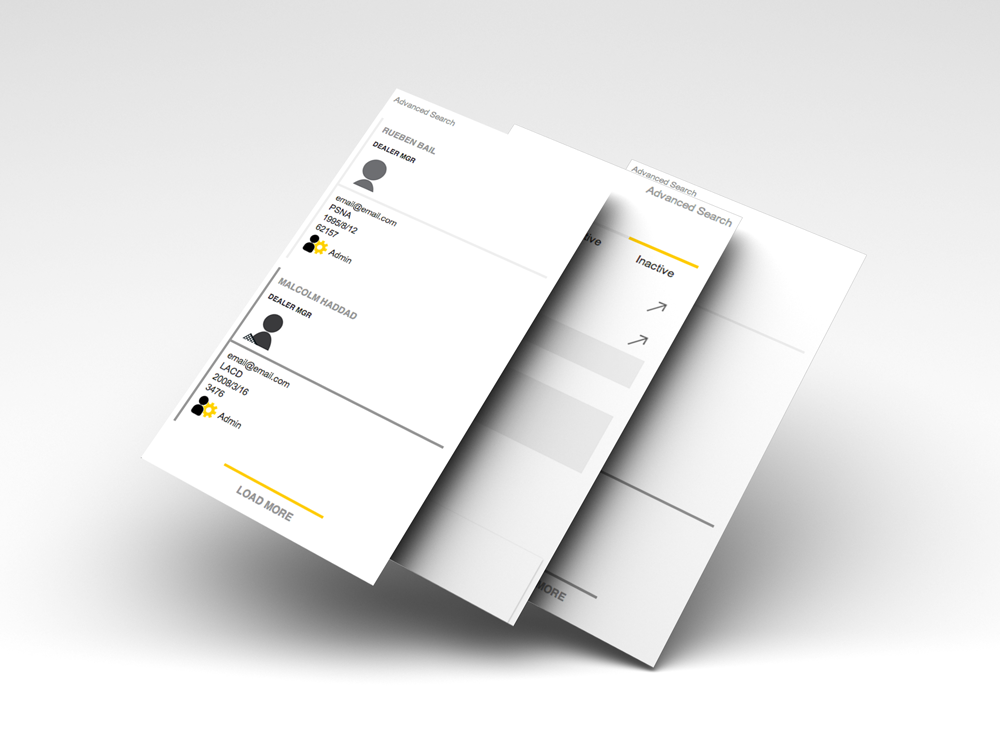
Screen-shots from a prototype that built for a recent inception. I had 4-days to come up with some graphics and UI elements for the project.
I spent 1-day doing user-interviews and observations of the current product that we were replacing. Then spent the following 3-days making a prototype. I’m not into vapor-ware, but sometimes it’s what you need to get the job done.
About the prototype
I built the prototype on a bare-bones sinatra-wrapper that I’ve been tweaking for such purposes. It’s setup for haml, has some starter partials, stylesheets, a helper file, is pre-setup for heroku and has a rake-task that will generate a new blank-template and start a fresh git-history. You can fork it on github if you like.
To make this thing quickly, I setup a series of arrays and looped over them with .rand() & .sample(). But that’s entirely another post.
Purpose
- Display claims, programs and users.
- Provide a simple filter.
- Quickly see product-groups associated with programs.
- Quickly see the approvers in list.
- Tap on the approver-avatar to see their name.
Disclaimer: Through user-interviews I was able to uncover some of the primary problems and attempt to solve them, but this was a quick/simple first-pass (4-days total).
Pretty stuffs
To add incpetion-showcase umph, I took screen shots and put them into this psd from dribbbble. Hope you like the concept.
