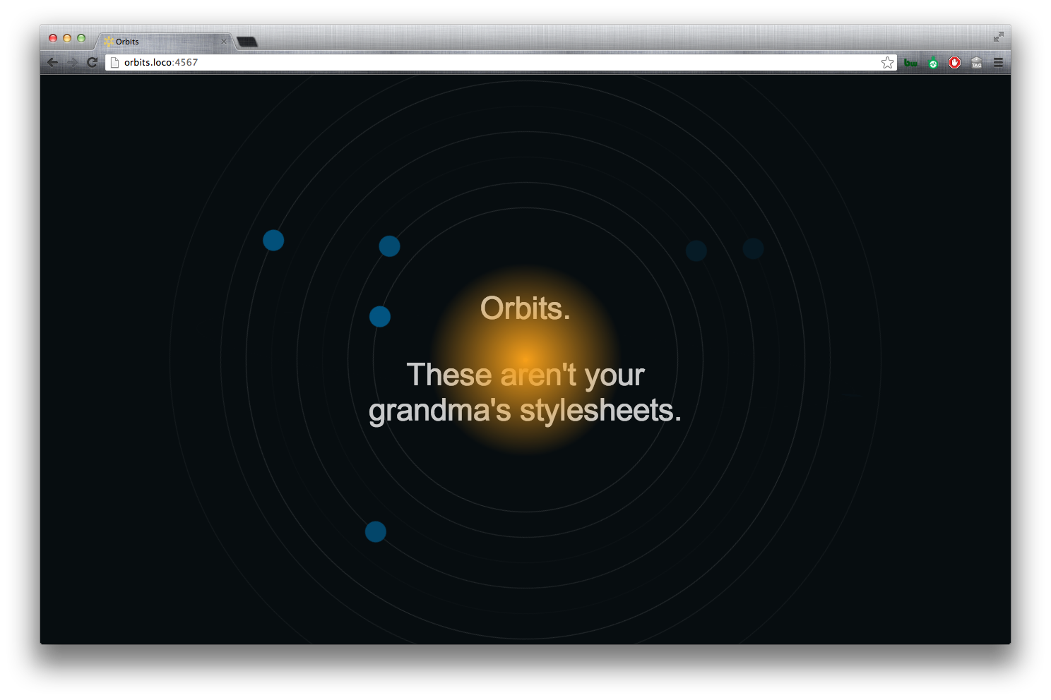
A stylesheet talk at 2013 ThoughtWorks North America Awayday #2013naad. We’ll look at how to use some of the powerful features of SASS to choreograph modular, maintainable and highly-flexible css keyframe animations.
Live demo
Github repo
Video
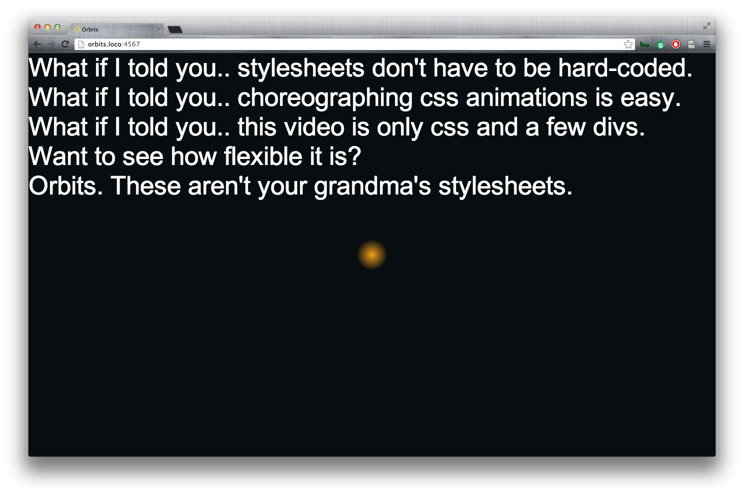
Speakers at TW Awayday are asked to create a 30-second commercial to promo their talk. The talk is about the video. The video is about the talk. So meta.
YouTube not loading? Click here
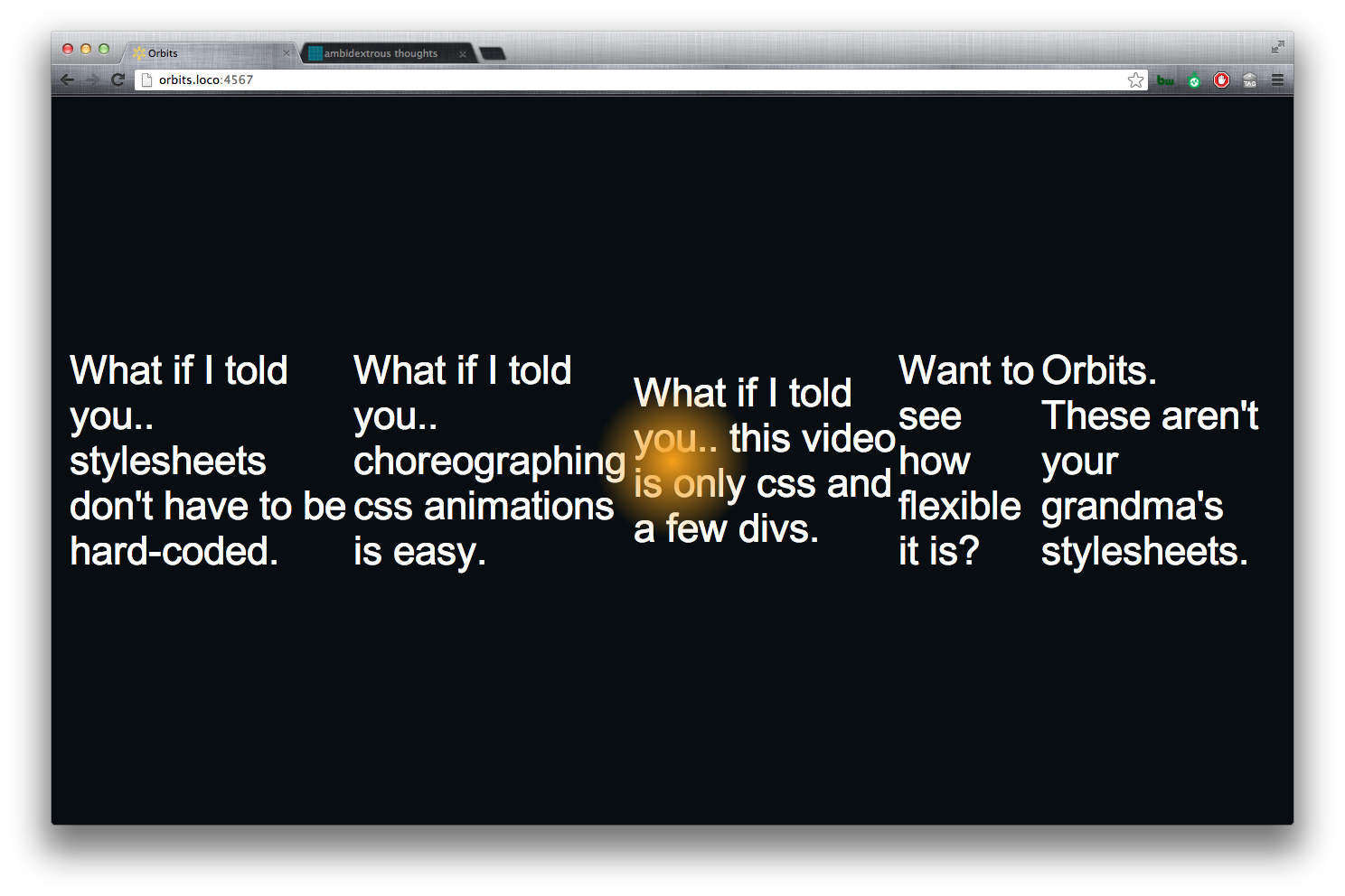
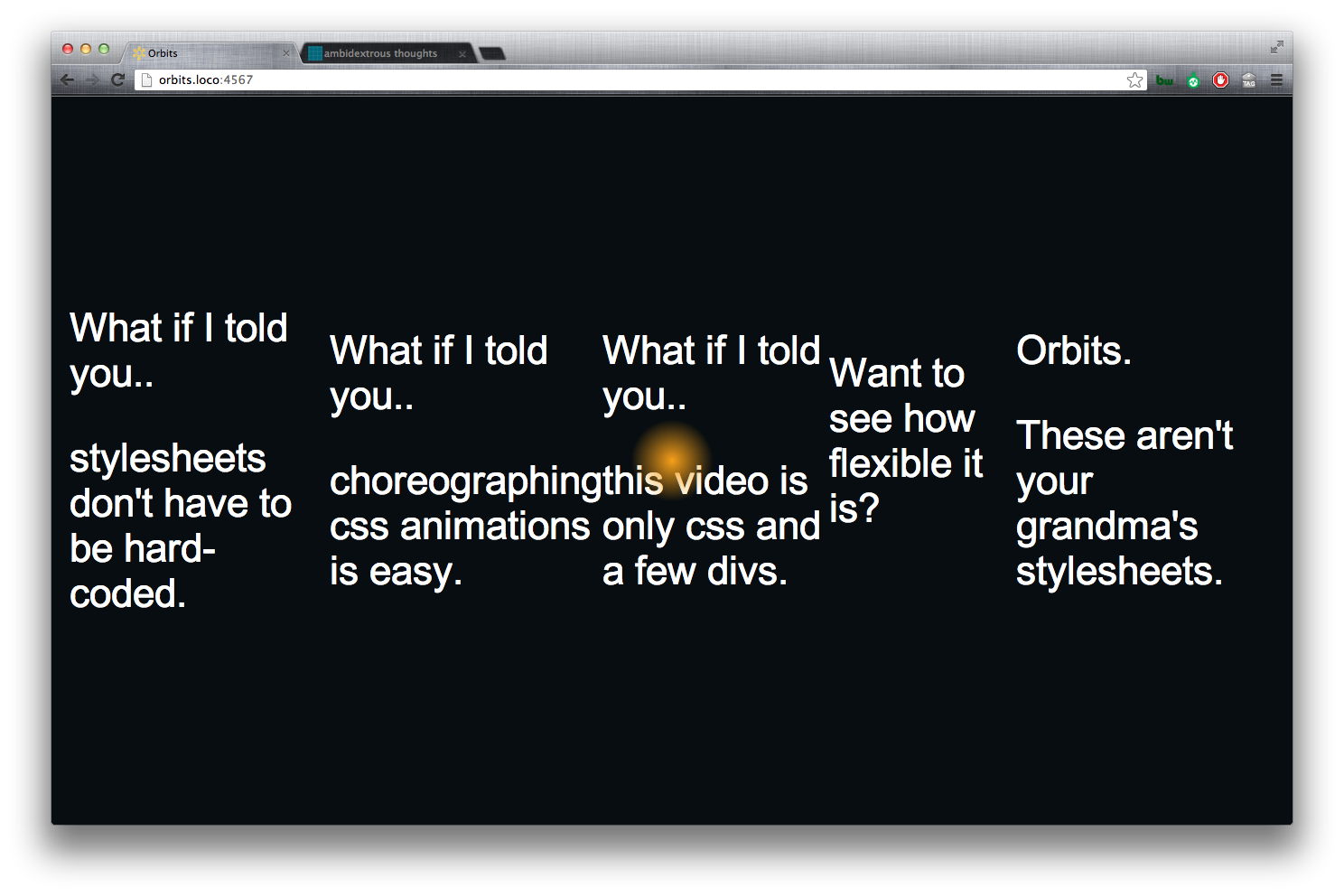
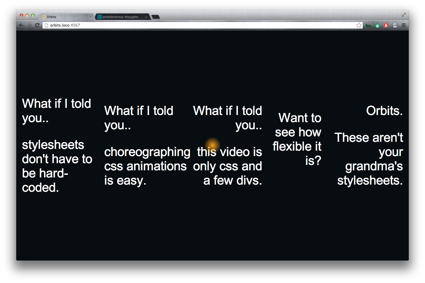
We’ll be looking at..
- Touch on some SASS features.
- Bourbon - a SASS pattern library.
- CSS transforms (scale and rotate).
- CSS keyframe animations.
- CSS :nth-of-type.
- How to use the above to create the demo.
SASS features
- $variables to drive our layouts and simplify tweaks/refactoring.
- @mixins
- @for loops.
- @function
- darken() function
- Referencing Parent Selectors: &
- round(), ciel() and floor()
Bourbon
We’ll be using Bourbon, a lightweight SASS pattern-library, to support CSS3 vendor prefixes. This will clean-up our code a bit and make it more readable/maintainable.
An important note: Including bourbon doesn’t write any code. It is merely a library of mixins that we can use if we so choose. aka not bootstrappopotamus.

Example use of bourbon
1 2 3 | |
Outputs:
1 2 3 4 5 | |
CSS Transforms
Scale
Scales an element based on its size.
1 2 3 | |
Rotate
You can rotate an element around its X, Y and Z axes. There are a few ways to rotate an element.
rotate( deg )rotateX( deg )rotateY( deg )rotateZ( deg )rotate3d( x, y, z, deg )
1 2 3 4 5 6 7 | |
Rotate3d
You gain improved-preformance from (some) webkit browsers by using rotate3d. See DeSandro’s article in the references below.
The syntax for rotate3d requires 4-arguments: X, Y, Z, and degrees to rotate.
1
| |
The axes’ rotations are product of the degree-value and the axis-value.
1
| |
Rotating the X-axis
The following will all rotate 180 degrees around around the X-axis.
1 2 3 4 5 6 7 | |
Rotating the Y-axis
The following will all rotate 180 degrees around around the Y-axis.
1 2 3 4 5 6 7 | |
Rotating the Z-axis
The following will all rotate 180 degrees around around the Z-axis.
1 2 3 4 5 6 7 8 9 | |
CSS Keyframe animations
Keyframes
This does not envoke an animation, but simply defines the keyframes/steps to animate between.
1 2 3 4 | |
Animation
Apply a set of keyframes to an element and tell it how long the animation will last.
1 2 3 4 | |
1 2 3 | |
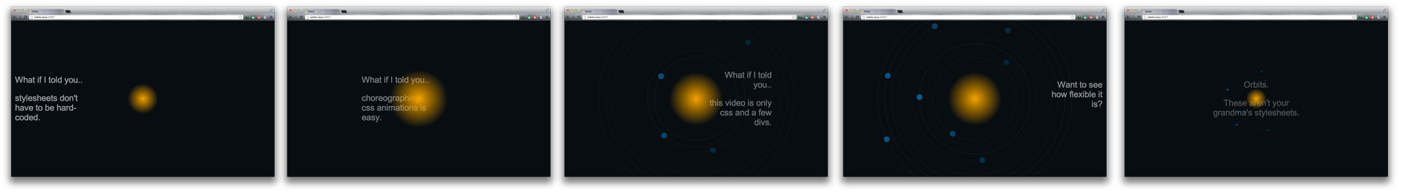
Time to start building
Setup the #milkyway and body background-color
Set the body’s background-color using a variable from our color palette and darken() function.
The darken and lighten functions allow you to move through the HSL color-space. This can be quite useful when need to create some contrast and already have a color-palette.
1 2 3 | |
Create a #milkyway container
We’ll create a reusable @mixin to ‘fill’ the screen with the #milkyway. This will helpful later as we’ll want to perform a zoom animation on everything inside the #milkyway later.
1 2 3 4 5 6 7 | |
1 2 3 | |
Note that this didn’t change the appearance of the screen.
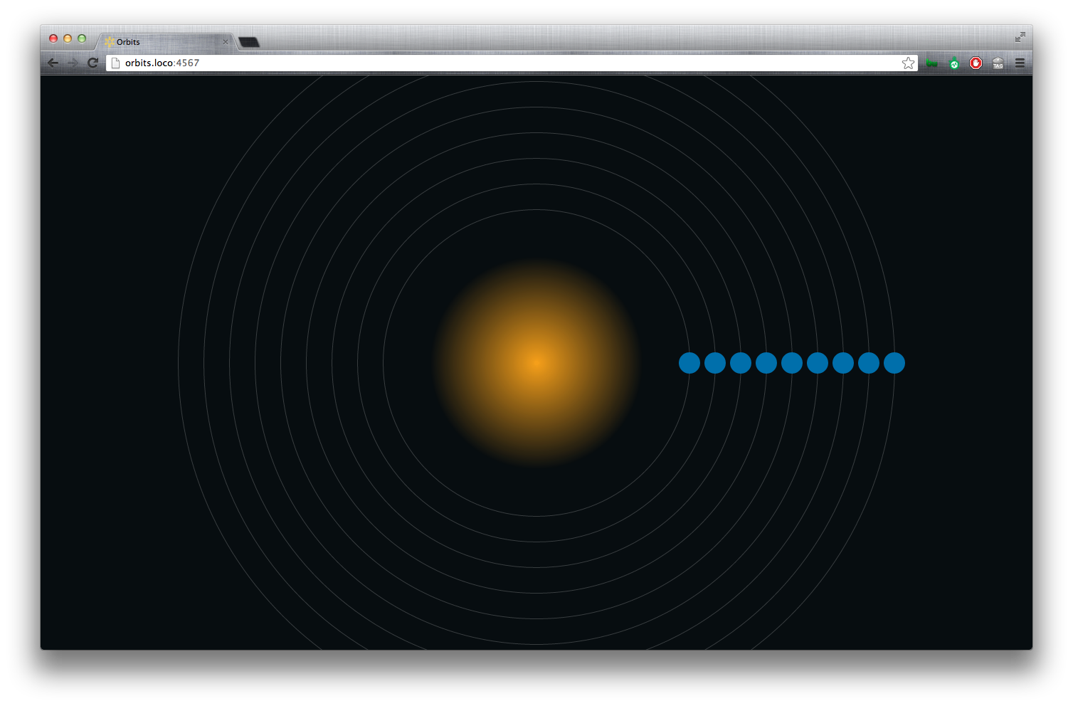
The Sun
Variable-driven size and position
Define the $sun-size.
The $sun-size will come in handy when we need to align elements with our sun and/or base other elements on the $sun-size. We’ll use this variable for height, width.
Make a reusable @mixin for a circle
To create a circle, we’ll need an object that is of equal height and width and has a 50% border-radius.
1 2 3 4 5 | |
1 2 | |
1 2 3 4 | |
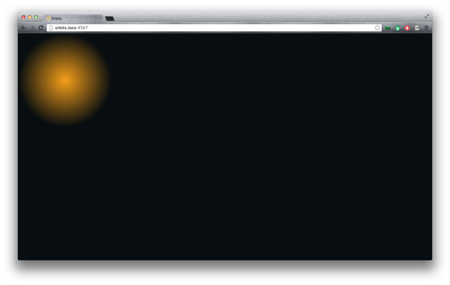
Center the sun
We also need to create a mixin to center the sun in the window. Since we have defined the size of the sun, we can set its position, top, left, bottom and right and margin properties.
We’ll make 3 @mixins for this so that we can reuse pieces of it (that’ll come in later).
1 2 3 4 5 6 7 8 9 10 11 12 13 14 15 16 17 18 | |
1 2 3 4 5 6 | |

Zoom-in animation
1 2 3 4 | |
1 2 | |
1 2 3 4 5 | |

Sun pulse animation
1 2 3 | |
1
| |
1 2 3 | |
We want the sun to pulse, but we know that our use won’t be able to see the animation until after the #milkyway is finished zooming in. So, we’ll apply an animation-delay and make it equal to the $zoomin-animation-duration.
1 2 | |
1 2 3 | |
Once the pulse-animation begins, we want the animation to continue infinitely and to alternate the direction of the pulse.
1 2 | |
1 2 3 | |
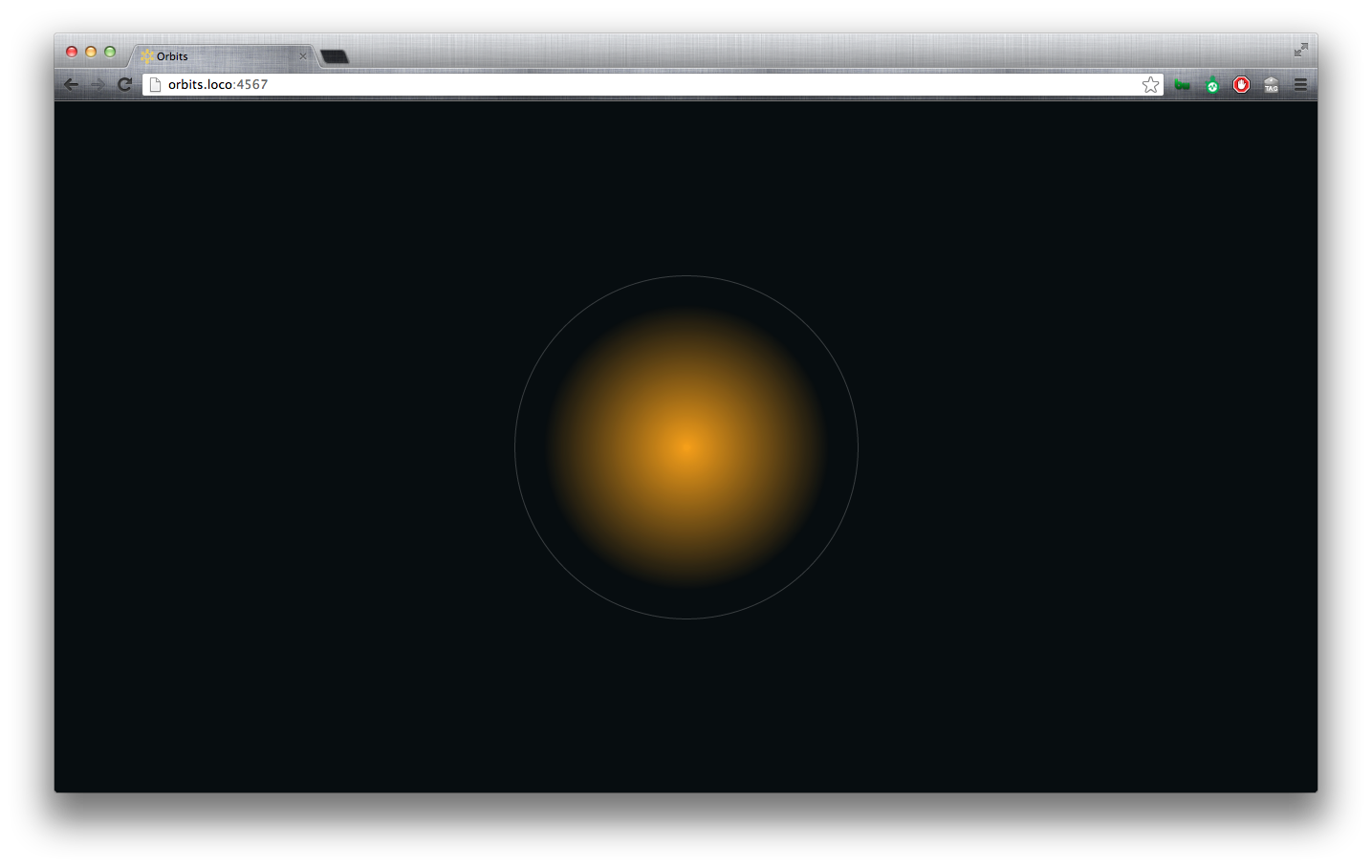
Orbits & Planets
Orbit
Before we can make a planet, we need to make an orbit. Then we’ll put the planet inside the orbit. This will let us animate the orbit and the planet will naturally move with its orbit.
- Base the
$orbit-sizeon$sun-size. - Reuse the circle
@mixin. - Reuse the center
@mixin.
1 2 | |
1 2 3 4 5 6 | |
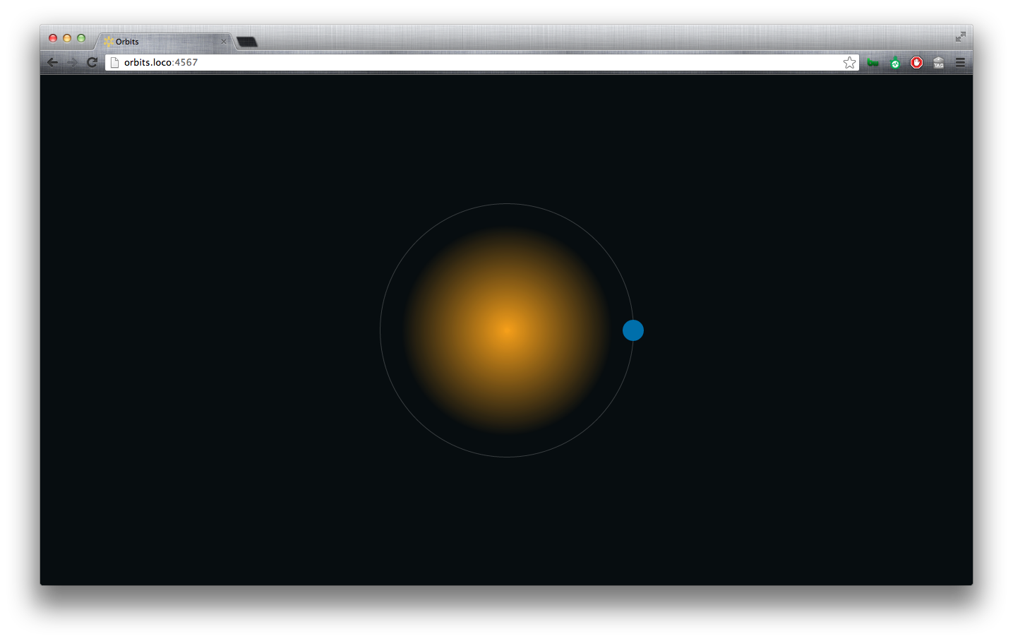
Planet
- Base the
$planet-sizeon$sun-size. - Reuse the circle
@mixin. - Position the planet absolutely inside its orbit.
- Center the planet vertically using the verticle-middle
@mixin. - Place the planet directly over the orbit’s border on the right side.
1 2 | |
1 2 3 4 5 6 7 | |
Create multiple orbits/planets
Use ruby/haml to quickly create multiple orbits/planets.
1 2 3 4 | |
Define the number of orbits in your variables file.
1
| |
Use a @for loop to enlarge the size of each orbit.
1 2 3 4 5 6 7 | |
Animate the orbits.
Completing a 360 degree rotation
In order to create a complete 360-degree rotation, we have to guide the rotation through 3-steps. Usually, you would have to write this out, but here we’ll use a @for loop.
- Define the value of your full
$rotation. - Define the number of steps to complete your rotation (
$rotation-keyframe-count). - Calculate the value of a
$rotation-keyframe.
1 2 3 4 5 6 7 8 9 | |
1 2 3 4 5 6 7 8 9 | |
I don’t really like the fact that my percentages don’t come out clean. This may cause some hiccups in easing-calculations. Fortunately we used a loop, so we can easily change the $rotation-keyframe-count from 3 to 4.
1 2 3 4 5 6 7 8 9 10 11 | |
1 2 3 4 5 6 7 8 9 10 11 12 13 | |
Ah. Much cleaner.
Apply orbit keyframes to .orbit
We don’t want the orbits to start until after the zoomin animation and a couple pulses of the sun.
So we’ll set $orbit-animation-delay to reflect that.
1 2 | |
1 2 3 | |
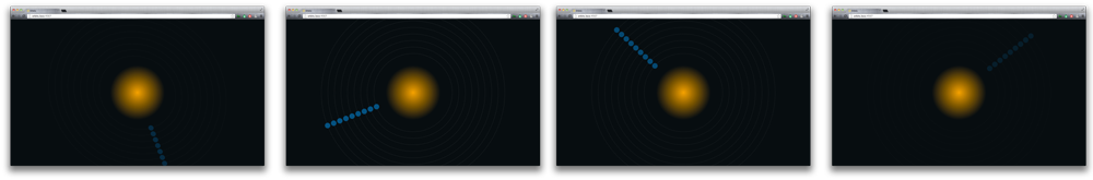
Stagger the orbit animation
The current animation works, but it doesn’t do much for me. I want to vary the speeds of the orbits. So we’ll add some logic to multiply the animation-duration in the .orbit @for loop.
1 2 3 4 5 6 7 8 9 10 11 12 13 14 15 16 | |
Oh. That’s better.
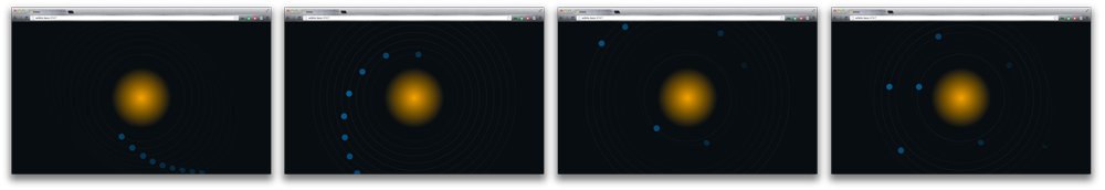
Zoom out
We want to zoom the scene out at the end. So let’s go ahead and time that up to be after 4-orbit-animations. We’re going to hook up the zoom-out to the #milkyway.
1 2 | |
1 2 3 4 | |
1 2 3 4 5 6 7 | |
Subtitles
Loop over content-arrays with haml
First let’s get the content onto the page. When it comes to content, I often find it nice to make a quick array and loop over it. This makes tweaking/refacting markup much easier/cleaner.
1 2 3 4 5 6 7 8 9 10 11 12 13 | |
1 2 3 4 5 6 | |
Use a mixin to drive the typography
Whenever creating typography styles, I like to put them into a typography partial. In a larger web-app, this helps us to see any/all type styles that we’re using.
1 2 3 4 5 6 7 | |
1 2 3 | |
Display table and table-cell.
Position the subtitles on the page. Vertically centering an unknown text-string with display: table; and display: table-cell; is nice.
Make the subtitle container a table and set the width.
1 2 3 4 5 6 7 8 9 10 11 | |
CSS :frist-of-type
We want to break each sentence into 2-pieces for readability. So let’s add some space between the first and second halves by setting the spans to display: block and adding margin-bottom: 1em; to the first half.
1 2 3 4 5 6 | |
1 2 3 4 5 6 | |
CSS :nth-of-type(n+foo)
We want to set the 2nd-half of the subtitles to text-align: right;. Well, the second-half, except for the last subtitle. We can select ‘all the but the frist nth-elements’ using css nth-of-type. For details on how this works, see Chris Coyier’s useful :nth-child recipes.
1 2 | |
1 2 3 4 5 | |
Add the subtitle animation.
Setup subtitle keyframes
- Create the subtitle keyframes. For now we’ll just fade them in and out with
opacity. - Set the orbit’s initial opacity to 0.
.orbit { opacity: 0; }
1 2 3 | |
1 2 3 | |
Subtitle animation timing
- Calculate the sum of the total animation time.
- Set the animation-duration for each subtitle.
- Divide the total-time by the number of messages to get the
animation-durationfor each subtitle. - Delay each subtitle animation.
We want the subtitle animation to last the entire-duration of all other animations combined. So first we’ll calculate the $total-animation-time, then divide that total by the $subtitle-count to determine the animation-duration for each subtitle.
1 2 3 4 5 6 7 8 9 10 11 12 13 14 15 16 | |
The animation-delay loop
Loop over the count of subtitles and delay each subtitle-animation by product of $subtitle-animation-duration*($i - 1). ($i - 1) is the count of previous subtitles.
1 2 3 4 5 6 7 8 9 10 11 | |

Modify the last subtitle
- Target the last subtitle.
- Set the display to fixed to take the last-element out of the flow of its siblings.
- Center it in the screen.
- Apply a new table/table-cell relationship.
CSS :last-of-type
We want to center the last subtitle in the window and center align the text. We can target the last subtitle with .subtitle:last-of-type.
Change the display property to fixed. Note that as soon as we change the display property of the element, the rest of the table-cells fall into place.. beautiful.
We’ll create a display: table; within a display: table; to vertically center text in the last subtitle.
1 2 3 4 5 6 7 8 9 10 11 12 13 14 15 | |
We’re done. Play time!
Now that our animations are all lined up. It’s time to have some fun. Change variables, mess with the orbit sizing function, add a planet-sizing function, etc.
References
- Paul Irish on the benefits of animating with translate.
- Lea Verou’s animation’s with one keyframe.
- David DeSandro on 3D transforms
- W3 Transforms
- Chris Coyier on
display: table; display: table-cell; - Sass functions
- Bourbon
- Constraints and Rotations - What you should know
- Chris Coyier’s useful
:nth-childand:nth-of-typerecipes