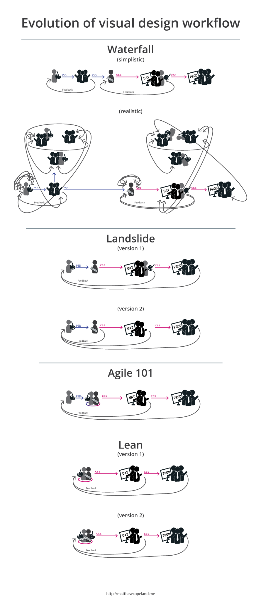
One example of how visual design workflow has changed from waterfall to lean in the digital space.
Context
This article points out visual design workflow deltas from waterfall → landslide → agile → lean.
This article is more of a 201-level and is intended for those familiar with various software methodologies and the associated design practices.
This article is specifically geared at visual-design. Other XD core-skills such as research, ia, interaction design and the associated ethnography, value and usability testing has been omitted so we can focuss on visual design workflow.
If the concept of seperating visual-design from interface-design is a bit of a struggle for you, think of it this way: You want to re-skin a site, but not change any interactions or layouts.
Waterfall

This is a seemingly simple process: 2-feedback loops.
But if you’ve designed in a waterfall workflow, you know very well that it actually looks a bit more like:
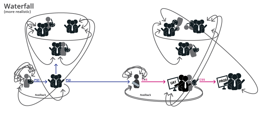
- Visual design and business communitcate via documents - a very slow way to work.
- Visual design spends hours building their visual language in a psd.
- Designs are submitted to the business and a series of stakeholders spend lots of time on email threads to create a thick-document of feedback.
- Repeat (for weeks/months) until the stakeholders are happy with a picture of their website-to-be.
- Business delivers documents and requirements to developers.
Thanks! See you in a few months!
- Communication is slim-to-none until after UAT.
- Even after UAT, no changes may be made without penalty.
- Visual design has 1-shot.
Waterfall’s disconnect between design and development
Visual never speaks to development prior to UAT. Visual has 1-shot at making their documents as beautiful and clearly communicated as possible. This leads to books of documentation, which takes time to refine and an equally long amount of time to read/digest.
Even after reading through a giant document, money is wasted again as development must take time to translate PSDs into visual assets. Common translation time-consumers are:
- Typefaces chosen aren’t suitable for web.
- Non-normal blending methods in gradients, shadows, and specific 1-off image-treatments.
- Inconsistent colors throughout a psd document as a result of color-pickers.
An example result of these inconsistencies and lack of communication: image-sprites are cut from the psd to save the devs the headache of fully translating the psd into css. This leads to tech-debt and future problems. Think retina screens.. and beyond retina (sorry kids, your @2x dribbble-tags aren’t going to last).
Landslide (version 1)
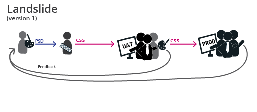
Landslide(fake-agile) is better than waterfall, but still not great as it lacks pairing of visual designers and devs. It’s common for teams to practice landslide without even knowing it. At least they’re trying.
- Visual design creates psd.
- Throws a PSD over the wall to a developer.
- Visuall design provides a more detailed PSD after UAT.
- Repeat.
Landslide (version 2)
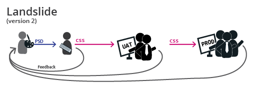
This is better than version 1, but still lacks pairing.
- Visual design creates psd.
- Throws over the wall to developer.
- Visuall design provides a more detailed PSD as feedback on a dev enviornment prior to UAT.
- Repeat until visual design is happy or end of iteration (whichever comes first).
- UAT is a bit faster as visual design has already provided feedback.
Landslide versions side-by-side


Agile 101
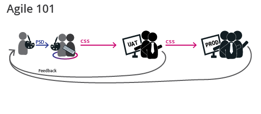
Finally pairing!
- Visual design creates psd. The key being that the psd is piecemal, not a comp. (thanks to Coleman for that one)
- Brings PSD to pair with dev.
- Dev and visual pair on translating psd.
- Future proofing can be discussed.
- Knowledge share / culture share can finally happen. Devs learning more about design princpals used and visual design learning more about how to execute their designs in the final medium.
Lean (version 1)
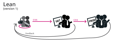
This is fast.
- Live changes to production code are the first and final medium.
- Visual design and dev work in the final medium.
- Visual design can tweak and polish on a consistent basis as their efforts are the final product.
- Icons, illustrations, and graphics are made as needed.
- Surprises are non-existent. You see how it looks in the browser now.
- Translation issues like non-normal blending methods for colors / shadow are non-existant.
- Time and money is saved.
- Feedback rounds result in modified stylesheets. No need for more documentation.
Lean (version 2)
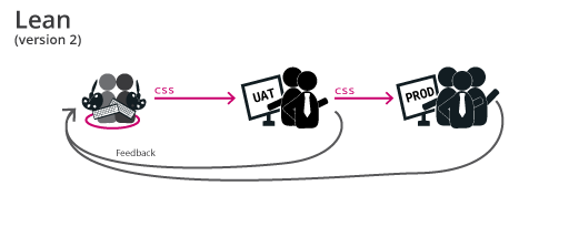
This is faster.
If you’re a visual designer looking to be at the top of the digital game, this might be your goal.
- Both are skilled as visual designers and developers.
- One of the pair may have stronger dev skills, the other may have stronger visual skills.
- Why two of them? Always pair. Never design in a silo.
- The team executes their ideas directly in code.
- No wasted time/money/documentation.
Where do these pairs exist?
- Startups
- Gaming industry
- Github
- Tech shops / Consultantcies (like ThoughtWorks, Pivotal Labs, thoughtbot )
- ..and other undiscovered places
Lean versions side-by-side


The big picture
Just because you made it this far. I had this at the top of my first draft, but everyone stopped there.
