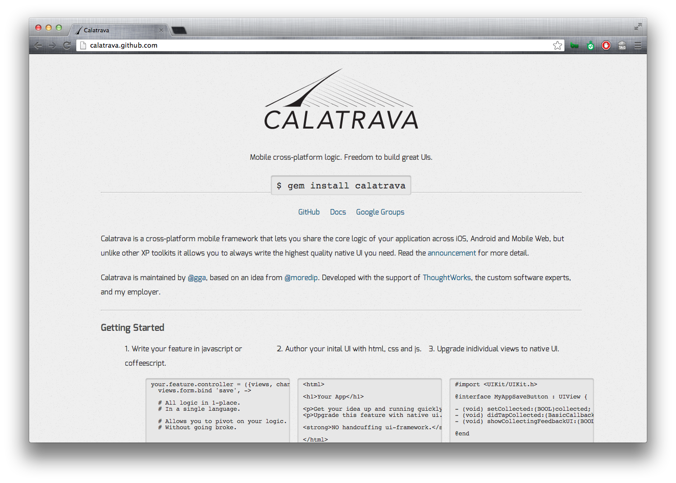
Collaborative design just makes everything better. This is how @colemanicewater, @gga and I polished and published the Calatrava logo in about 2-hours.
Building for multiple devices? Checkout Calatrava.
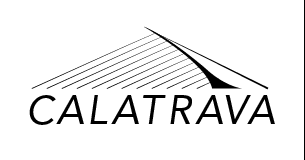
Here’s the final result
The concept
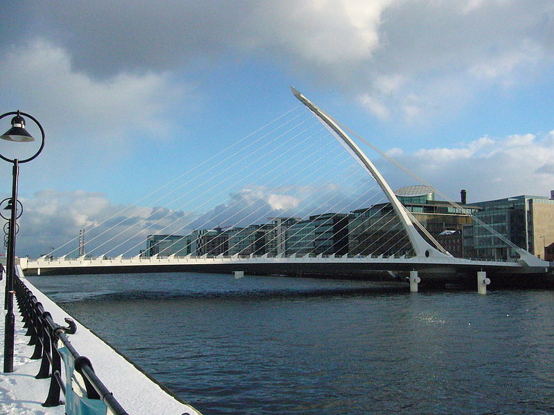
The talented Giles Alexander wanted a logo for an awesome framework, Calatrava. Given the bridge-ish nature of the framework, Giles named the framework after the sturctural engineer/architect Santiago Calatrava. Giles’ intial idea was to base the logo the The Calatrava bridge in Dublin.
Getting started
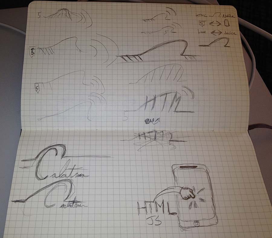
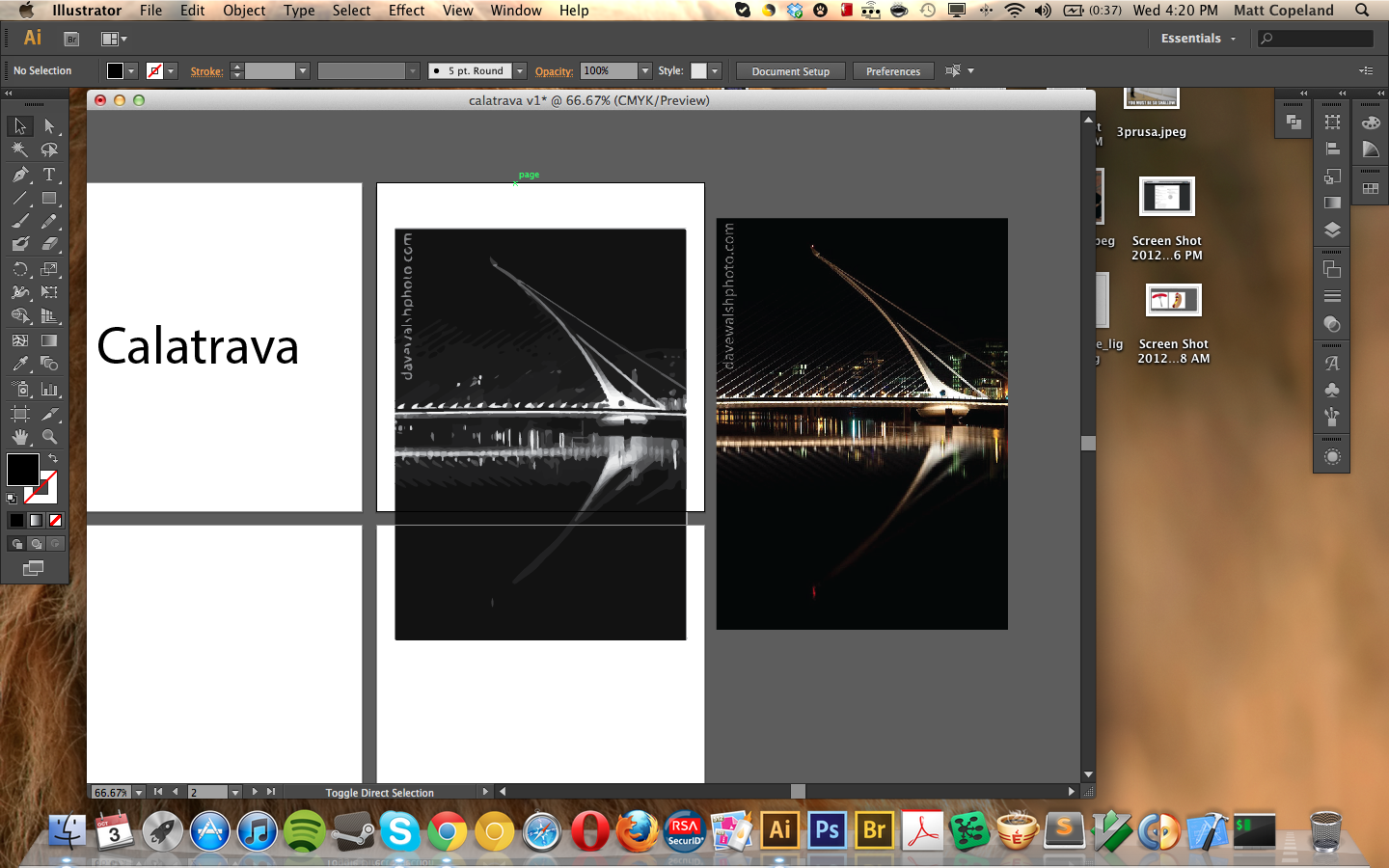
As Coleman and I were in different cities at the time (Chicago and NYC), I started the process off by chatting with Giles and then spent the first hour building out some concepts in illustrator. By myself, this would’ve taken quite a while to stew. But thanks to collaboration we polished up in about an hour.
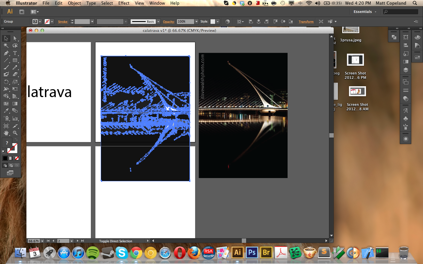
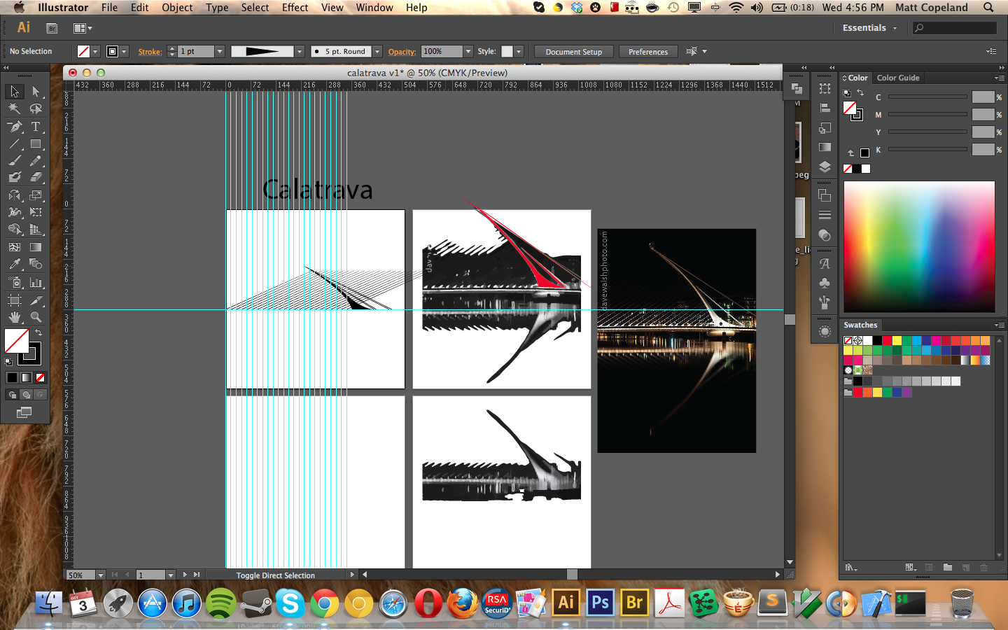
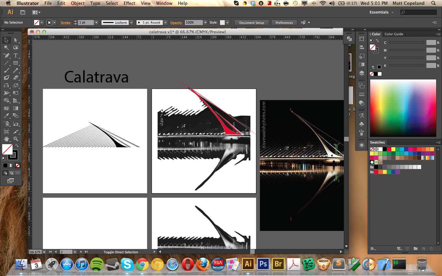
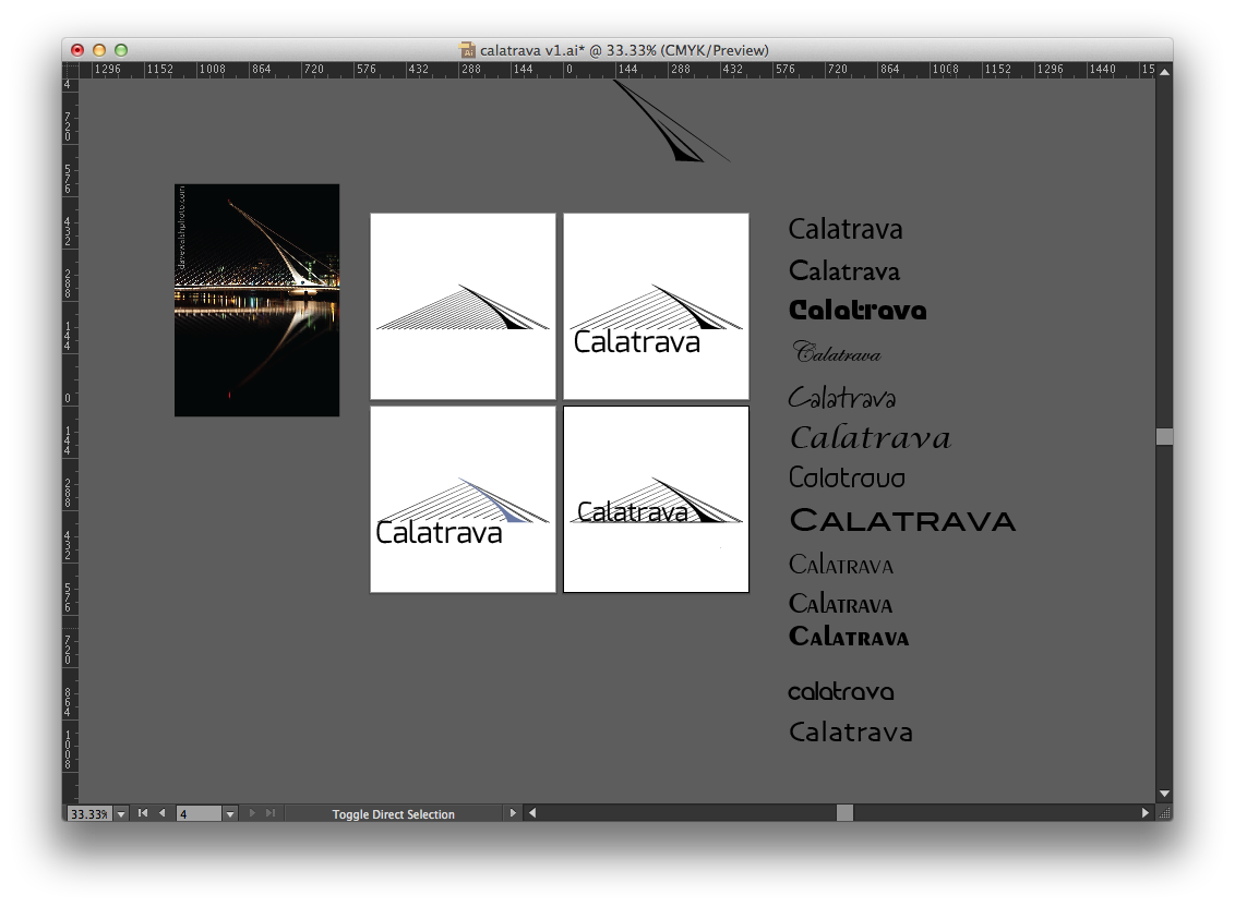
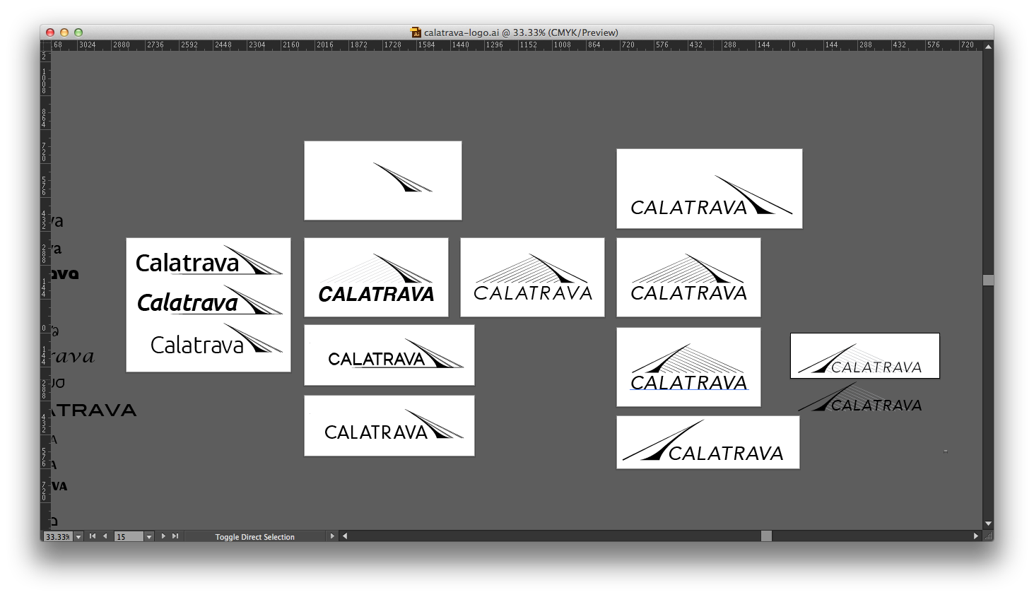
Collaboration
Coleman Collins 1:13 PM
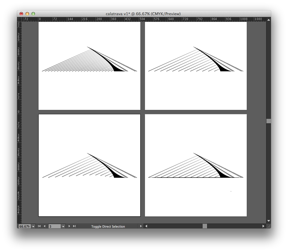
http://d.pr/i/4Z8D that top right one feels so very 90’s Microsoft to me i’m not sure why
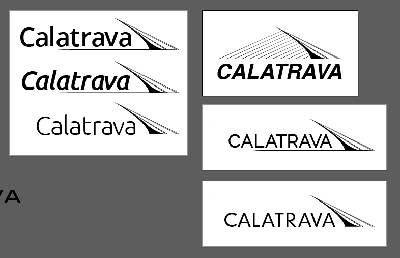
Matt Copeland 1:15 PM
I do think it’s much cleaner without the full set of cables. I’m not sure why i’m feeling attached to the cables. Ground me on that one? Is there something to the bridge look with cables or should I kill the baby?
Coleman Collins 1:21 PM
it’s not baby bias there are good things about the cables it makes it look bridgier http://d.pr/i/oIab
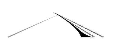
Matt Copeland 1:22 PM
hrmm.. teepee? lol
Coleman Collins 1:22 PM
that was my thought as well the problem with the cables is they help in the “looks like a bridge!” department and an attractive illustration department
Coleman Collins 1:46 PM
ಠ_ಠ http://d.pr/i/xMtD Avenir’s pretty nice
Coleman Collins 1:48 PM
so here’s a thought on the cables this bridge already doesn’t look like a bridge why are we giving up mark strength, reproducibility, ‘clean-ness’ to make it look bridgier? (big assumption coming) people that get the reference to the bridge are going to get it regardless and people that don’t are looking at an abstract mark anyway but then again the abstract mark is attractive with the lines
Coleman Collins 1:51 PM
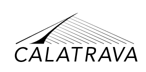
tradeoffs http://d.pr/i/XYaT it works pretty well flipped, too
Coleman Collins 1:57 PM
logical next step: http://d.pr/i/m0dw there’s the other consideration we haven’t considered, btw which is domain-appropriateness because I would buy the fuck out of a sailboat with that logo but is it a software framework?

Coleman Collins 2:01 PM
(with ghosted guylines http://d.pr/i/zUQ4)

Matt Copeland 2:02 PM
I think you nailed it with http://d.pr/i/XYaT

Coleman Collins 2:05 PM
I think that one’s got it too. but you’ve gotta keep doing it wrong to make sure sometimes
The outcome
An illustrator file full canvases:
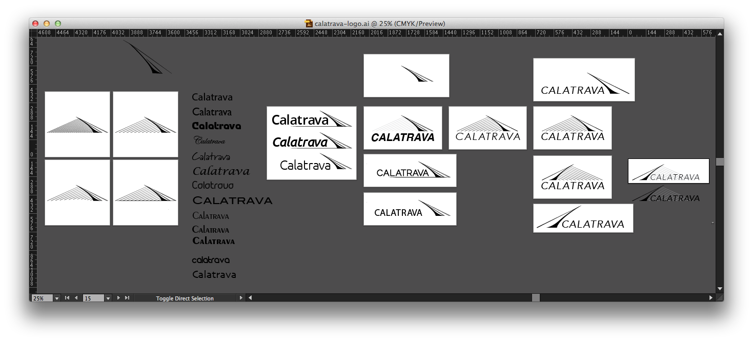
And a clean logo, worthy of the software.
