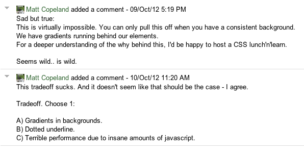
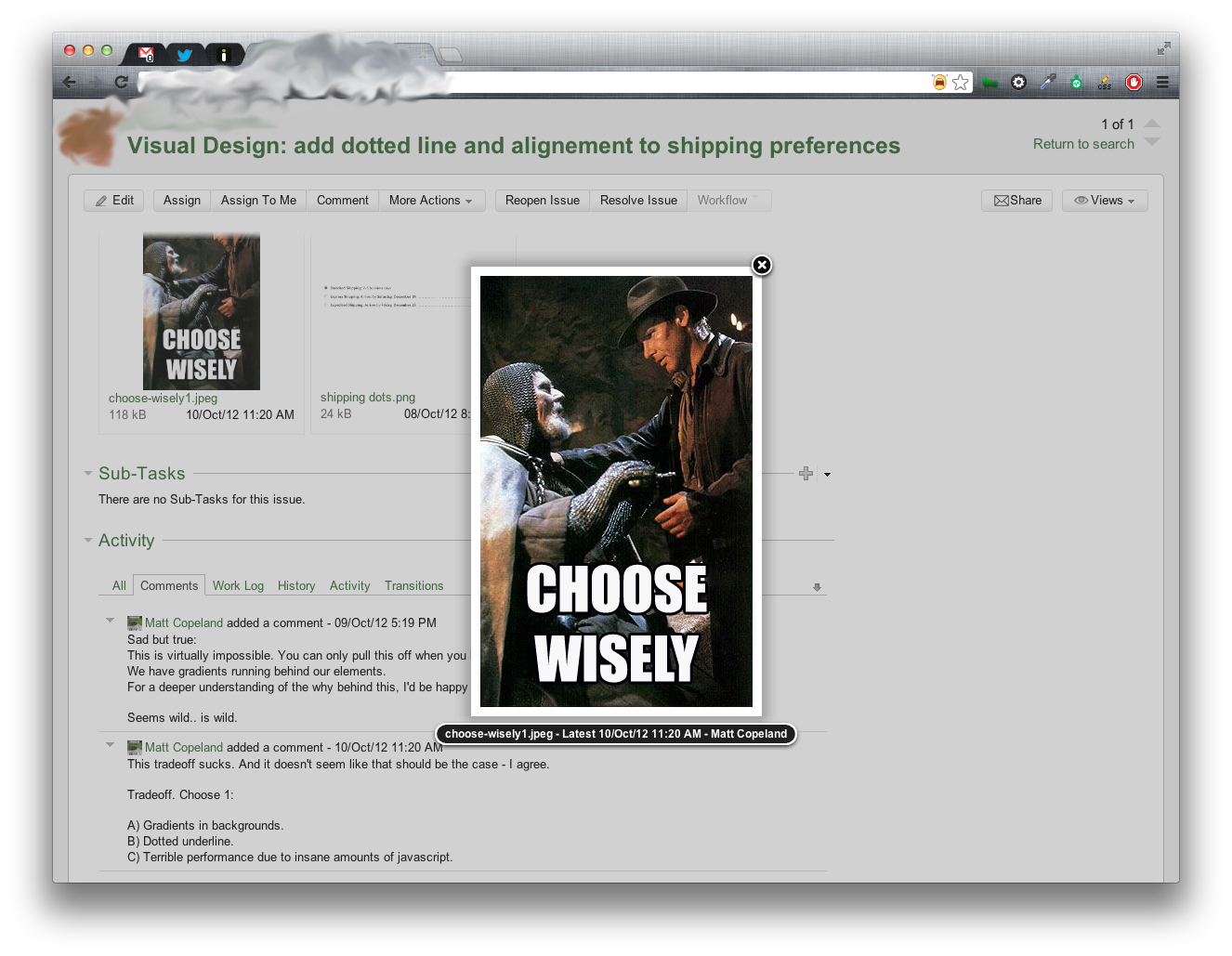
When face-to-face communication isn’t an option, it can be challenging to express your tone. A method that I’ve found to be effective: use a meme. Here’s an example.
Visual design request:
The seemingly-simple request was for a dotted underline between elements, like this:

Response: delivering the bad news.
The response in pure text feels a bit harsh, perhaps even snarky - maybe I just have poor manners.

Make it friendly: add a meme.
The simple addition really makes the difference.

Bonus CSS challenge
Given the following contraints, how could we have made this dotted-line work?
- You may only use: css/sass and haml/ruby.
- No javascript.
- No tables.
- Element is in a liquid container.
- Body/containers have background-gradients.
- Position of element on page: unpredictable.
- Length of string: unpredictable.